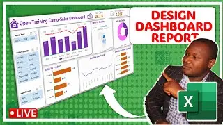
How to Design Dashboard Reports in Microsoft Excel using Pivot Tables & Pivot Charts
In this class, we shall learn how to design highly interactive dashboard reports in Microsoft Excel using Pivot Tables and Pivot Charts. Join our Free Weekly Classes here: https://chat.whatsapp.com/JXgg0qFdojP...
We are going to be analyzing a simple Sales Dataset and our interest is to visualize our findings and display all the key metrics on one single-page Excel dashboard.
To grab the file so that you can follow along please click this link below;
https://docs.google.com/spreadsheets/...
While we design this dashboard, you will learn how to;
1. How to structure a Dashboard Report in Microsoft Excel.
2. How to choose the right chart types to use in our Excel Dashboards.
3. How to use Slicers as visual filters for interactivity in our Dashboard Report
4. How to use Pivot Tables for data analysis.
5. How to use Illustrations (shapes and Icons) to beautify your dashboard reports.
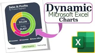
6. How to create Bar Charts, Line Charts, Donought Charts and Map Charts.
7. How to format Excel charts for data visualization and so much more.
------------------------------------------------------------------------------------------------------------------
To learn more about Microsoft Excel, feel free to join our free community using this link:
https://chat.whatsapp.com/ImFuaZLuOZ8...
Use the link below to learn how to Design a Sales Dashboard Report in Excel.
• How to Design a Dashboard Report in E...
Let's connect on Other Social Media
TikTok: https://vm.tiktok.com/ZMFcXgkJY
Thank you for watching! If you would like to contact me for training your team. My WhatsApp number: is +256 773 523 826 Email Address: is [email protected]


![Introduction to Power BI DAX formulas for Complete Beginners [Live Online Class]](https://images.videosashka.com/watch/dYuVq0pR4Hs)