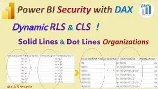
Power BI DAX: Add Status Labels and Colours to Visual’s Value and Title with calculated Measures
Power BI is a powerful data visualization tool that helps users transform data into meaningful insights. However, to get the most out of Power BI, it's essential to have a good understanding of its Data Analysis Expressions (DAX) language. This is because DAX enables users to create calculated measures and columns, which can help to answer complex business questions and reveal insights that are not immediately apparent in the data.
One important aspect of using DAX in Power BI is creating calculated string measures. These measures are used to display text values in visualizations, such as tables, charts, and matrices.In this vidoe of "Power BI DAX & Visualizations: Calculated Measures adds Status and Colours to Visual’s Value ,Label and Title", users learn how to create calculated string measures in Power BI to enhance the visual impact of their reports. The video covers an aprrpoach for creating calculated string measures, including creating text string and colour code string measures, using conditional formatting to change the status and color of values based on their target value, and using these measures to dynamically update the title and labels of visualizations as well. The video is designed for users who have some prior experience with Power BI and are comfortable working with the DAX language.
The DAX formula in this video can be found and copied from My blog site:
https://mikeyubianalytics.blogspot.co...