Power BI DAX Tips: Create Stock Price RSI Chart with Power BI Line & Stacked Column Visual
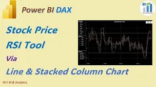
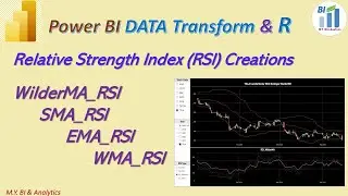
In Previous video we have created the four types of RSI via Data Transform through R script. In this video I have shared a method on how to draw a chart via power Line & Stack Column Visual, in which we can select and apply different RSI for our stock price movement analysis.
We need two steps to create the chart. First step is to prepare data via creation of few measures by DAX formula.
The First measure is a Dimension table measure in which we shall list what RSI types we have,
Then we need table measure to hold all other measure we shall create for this video. For example, The Second measure is the selected RSI type via applying the DAX switch and selectedvalue function to match each RSI type with it’s corresponding created RSI type field.
Then we need OverBoughtline which is y axis constant line with the value 70, and OversoldLine which constant value is 30.
Last measure is for the dynamic title for the chart which combine the selected RSI type measure and selected stockcode measure.
Before visual creation we need to ensure our data modelling is ready to support the creation via all necessary relationship connect setups.
Now we are ready to draw the chart.
First we need to prepare three slicers for stockcode selection, trading date selection and RSI type selection. Then we draw the RSI line chart with options to select RSI type dynamiclly. Video has demostrated all related how to steps to configure data inputs and visual formatings
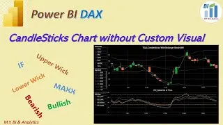
To apply the RSI chart we need to combine other technical analysis tool in same report page, such as Candlestick chart. So in coming video I shall share a approach to create Candlestick chart in Power BI standard Line & Stacked Column visual ( without custom visual) in which we can easy to sync and align the x axis value accurately for both charts in a page. That is reason I draw the RSI chart via power BI line & Stacked Column Chart. Please Do not miss it by subscripting my channel. Thanks for your watching and See you in next video.


