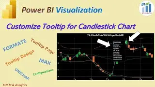
Power BI DAX tips: Customize Tooltip for a Candlestick Chart,
Stock Price Candlestick chart combined with value info of Bollinger Bands and Trade Volume provides rich data info from each date point. A customized rich tooltip will be very helpful and necessary for chart users to read and analyse the complex chart info when hovering over the interested data point. In the video I have demonstrated a way on how to create a customized tooltip for a Candlestick chart with a measure creation via DAX formula.
References:
Create report tooltip pages in Power BI - Power BI | Microsoft Learn:
https://learn.microsoft.com/en-us/pow...