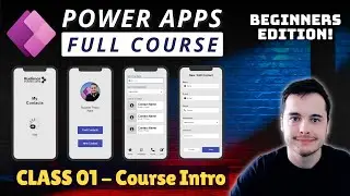
Responsive Gallery design with containers in Power Apps
Building Responsive Galleries in Power Apps: A Simple Guide
Do you want to make a flexible and responsive gallery in Power Apps? Whether you're experienced or just starting out, this tutorial will show you, step-by-step, how to make a dynamic gallery using nested containers. You'll learn new ways to design and improve your app-building skills with these easy-to-follow techniques. This guide will cover everything from using Power FX formulas to creating adaptive layouts for any device, making it perfect for beginners and advanced users of Microsoft Power Apps.
🔵 Key Topics Covered:
1. What Are Nested Containers?
Learn what nested containers are and why they are important for building flexible layouts in Power Apps. Discover how nested containers help with responsive design and adaptive gallery layouts.
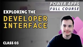
2. How to Build a Nested Container Structure
Follow along as we create a gallery using nested horizontal and vertical containers for more flexibility. Building these structures will help you make better Power Apps with responsive galleries that adapt to different devices.
3. Resizing Elements and Using Formulas
Learn how to resize gallery elements properly and use Power FX formulas to keep everything looking neat. Power FX is key for building dynamic apps that change based on user interactions.
4. Making Containers Fit Any Screen Size
Find out how to make your containers adjust easily to different screen sizes, like desktop, tablet, or mobile. Ensuring responsiveness is important in Power Apps for user experience.
5. Aligning Items in the Gallery
Learn simple ways to align elements so your gallery looks clean and professional. Aligning elements properly helps maintain a consistent and visually appealing design in your Power Apps gallery.
6. Resizing Text for a Better User Experience
See how to adjust text size so it looks good on any device and makes your app easy to use. Using dynamic text resizing helps improve readability across different devices.
Timeline:
0:01 - Introduction: Improving the Flexible Gallery with Nested Containers
0:47 - Demonstrating Nested Containers and Template Screens
1:56 - Implementing Nested Containers in Our Gallery
3:06 - Adjusting Elements and Repositioning within Containers
5:16 - Finalizing the Responsive Gallery and Next Steps
🔥 Make Your Apps Look Great on Any Device
Start creating Power Apps that adjust easily to different screen sizes! This tutorial will help you build user interfaces that look great on any device, making sure your apps leave a strong impression. You will learn how to use Power FX, responsive containers, and alignment techniques that are essential for adaptive apps.
📚 Stay Updated with More Tutorials
Don't forget to hit the "Subscribe" button and click the notification bell to stay updated with our latest Power Apps tutorials, tips, and tricks. We love hearing from you! Leave a comment below to tell us what topics you'd like us to cover next.
✨ Improve Your Skills
Ready to start building responsive Power Apps? Follow our guide and take your app development skills to the next level. Learn more about building Power Apps galleries, nested containers, and Power FX formulas that can help you create dynamic, adaptive applications. Thanks for watching, and we can't wait to see you in the next tutorial!
#PowerApps #ResponsiveDesign #ResponsiveApps #Containers #HorizontalContainer #VerticalContainer #PowerFX #MicrosoftPowerApps #AppDevelopment #GalleryLayout #DynamicUI #UserInterface #AdaptiveDesign


![ЛЕГИОНКА ДЕЛО ГОВОРИТ [DOTA2]](https://images.videosashka.com/watch/DHkwP_b-NiI)