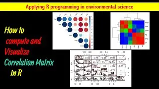
Compute and Visualize Correlation Matrix in R||
Correlation matrix : Analyze and visualize a correlation matrix using R
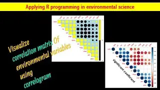
Correlation matrix analysis is an important method to find dependence between variables. This video describes how to visualize “correlation matrix” in R in three method.
1- Visualize correlation matrix using correlogram: R corrplot function is used to plot the graph of the correlation matrix. In the plot, correlation coefficients are colored according to the value. Correlation matrix can be also reordered according to the degree of association between variables.
2- Use chart.Correlation() function: Draw scatter plots: The function chart.Correlation()[ in the package PerformanceAnalytics], can be used to display a chart of a correlation matrix.
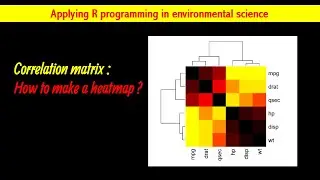
3- Use heatmap(): A heat map is a data visualization technique that shows magnitude of a phenomenon as color in two dimensions.
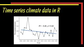
☑️How to Make Time Series Climate Data in R | #Trend Data in R | Plot Time Series
• How to Make Time Series Climate Data ...
☑️How to Plot #ndvi time series in R Studio|| Normalized Difference Vegetation Index
• How to Plot #ndvi time series in R...
☑️Plot Pearson Correlation Coefficient of Multiple Variables|| R Studio
• Plot Pearson Correlation Coefficient ...
If you like my video don't forget to like, share and subscribe to my channel.
/ @resneed1
🙏Thank you so much for watching.🙏
#ggplot
#ggplot2
#rprogramming
#ggplot2
#visualization
#rprogramming
#correction