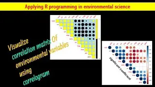
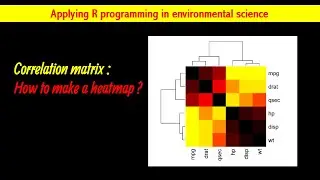
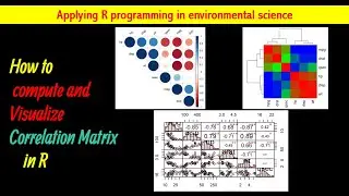
Visualize Correlation Matrix Using Correlogram||
This article describes how to plot a correlogram in R. Correlogram is a graph of correlation matrix. It is very useful to highlight the most correlated variables in a data table. In this plot, correlation coefficients is colored according to the value. Correlation matrix can be also reordered according to the degree of association between variables.
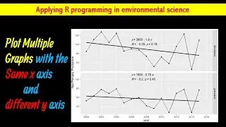
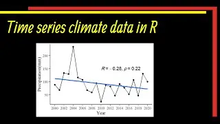
☑️How to Make Time Series Climate Data in R | #Trend Data in R | Plot Time Series ☑️
• How to Make Time Series Climate Data ...
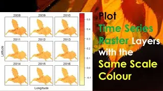
☑️How to Plot #ndvi time series in R Studio|| Normalized Difference Vegetation Index☑️
• How to Plot #ndvi time series in R...
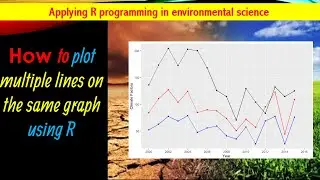
☑️Plot Pearson Correlation Coefficient of Multiple Variables|| R Studio☑️
• Plot Pearson Correlation Coefficient ...
If you like my video don't forget to like, share and subscribe to my channel.
/ @resneed1
🙏Thank you so much for watching.🙏
#drought
#heatmap
#rstudio