How to Adjust the Underline With and Size in CSS || Text decoration in css || HTML || CSS
How to Adjust the Underline With and Size in CSS
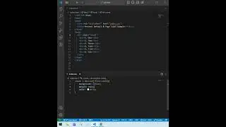
This CSS code customizes the underline for a p element by using a background-image with a linear-gradient. Here's a breakdown of how it works:
display: inline-block;: Converts the p element to an inline-block, allowing control over the element's dimensions and positioning of the underline.
background-image: linear-gradient(transparent 70%, red 20%);: Creates a background with a gradient that transitions from transparent to red, effectively simulating an underline. The red portion appears at 20% of the gradient's height, while the rest remains transparent.
background-size: 40% 16px;: Controls the size of the gradient background. 40% sets the width of the underline relative to the width of the p element, and 16px determines the height of the background area, influencing how far the underline extends downward.
background-repeat: no-repeat;: Ensures that the gradient (underline) appears only once under the text.
background-position: left bottom;: Positions the gradient at the bottom-left corner of the p element, making it align like a typical underline.
In summary, this code creates a custom underline with a specific length (40% of the text width) and a specific color (red) positioned at the bottom of the p element.
how to style underline in css, customizing underline color, css text decoration tips, adjust underline length css, css underline width control, creating custom underlines, css text decoration examples, underline thickness css, css text decoration properties, how to change underline color, css underline design ideas, advanced text decoration css, css underline customization, creative underline styles, css underline color change, adjusting underline position, css text underline tricks, underline length in css, css text decoration tutorial, css underline width adjust
#css #html #underline


