Creating Actual vs Target Chart in Excel - Excel Tips and Tricks
Learn how to create Actual vs Target Chart in Excel. Or Actual vs Budget Chart in Excel.
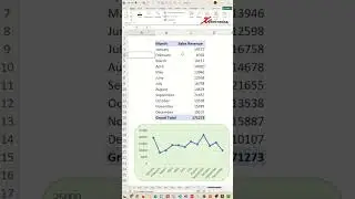
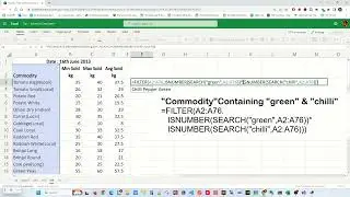
Creating a target vs actual chart in Excel involves a few steps. To begin, select the data you want to include in the chart, including both the target and actual values. Next, insert a bar chart by navigating to the "Insert" tab and choosing the appropriate chart type. Once the chart is created, you can add a target line by right-clicking on the chart, selecting "Add Data," and inputting the target values. The formula for target vs actual is often expressed as the percentage difference between the actual and target values, calculated using the formula:
(Actual−Target)/Target×100%. A popular chart for comparing actual with target values is the bar chart, where bars represent actual values, and a line or another set of bars denotes the target values. The forecast vs actual graph, on the other hand, typically compares predicted values with actual outcomes over time. For comparing actual vs budget, the best chart is often the variance analysis chart, which highlights the differences between actual and budgeted values, aiding in effective performance analysis.
Insert Chart
1) Ctrl + A
2) Alt + F1
3) Resize and reposition
Change Chart Type
1) Right-click chart
2) Change Chart Type
3) Combo
4) OK
Create Budget/Target Marker
1) Select Orange line chart
2) Right-click on Orange line chart
3) Format Data Series..
4) Fill & Line
5) No line
6) Marker
7) Marker Options
8) Built-In
9) Select Marker Type
10) Size = 20
🔗🔗 LINKS TO SIMILIAR VIDEOS 🔗🔗
Creating Actual vs Target Chart in Excel - Excel Tip and Tricks
• Creating Actual vs Target Chart in Ex...
Creating Actual vs Target Chart in Excel - Excel Tip and Tricks - DETAIL EXPLANATION
• Creating Actual vs Target Chart in Ex...
#shorts #microsoft #excel #microsoft #tiktok #shortvideo #howto