Scale Your Buttons Up or Down Automatically in Elementor - Perfectly Responsive Buttons - WordPress
Elementor Units Explained - How and When You Should Use PX, REM, EM, %, VH and VW: • Elementor Units Explained - How and W...
Get Elementor: https://be.elementor.com/visit/?bta=2...
Hosting I love and recommend for most clients and for those on a budget: https://www.hostg.xyz/SHBd2
🧙 Wizards of Webcraft – A series where I’ll be reviewing your websites - https://www.reialesa.com/wow/ Apply now!
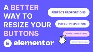
Using buttons in Elementor is a pretty easy process. It's very possible you've never actually thought about it much until now. But, there's a way to use buttons more efficiently and make sure they look consistent throughout your website, no matter their size.
You can do that by simply using EM for padding. Doing so will make sure the padding is going to scale up or down with the font size. 1EM is going to represent 100% of the font size, 1.5EM is going to represent 150% of the font size and so on. This matters because it means your buttons will resize themselves, automatically, when you change the font size. The proportions are going to stay the exact same.
That means that your mobile buttons are going to look exactly the same as your desktop buttons, just smaller - or bigger, if you're feeling adventurous. You don't need to adjust the padding for your tablet or mobile, because everything is going to depend on the font size.
This is a great way to make sure your buttons look and work exactly the way you want them to.
#elementor #buttons #responsive
Get in touch:
https://www.reialesa.com/youtube/
Don’t be shy! Let me know what you’d like to see next, ask me anything related to design or just simply say hi.
Please note that some of the above are affiliate links, which means I earn a commission if you make a purchase, at no additional cost to you. Thank you very much if you decide to use them!


