Fully Responsive Heading With Different Font Sizes in Elementor - WordPress
The CSS required to do this is pinned 📌 to the top comment.
Elementor Units Explained - How and When You Should Use PX, REM, EM, %, VH and VW: • Elementor Units Explained - How and W...
Get Elementor: https://be.elementor.com/visit/?bta=2...
Hosting I love and recommend for most clients and for those on a budget: https://www.hostg.xyz/SHBd2
🧙 Wizards of Webcraft – A series where I’ll be reviewing your websites - https://www.reialesa.com/wow/ Apply now!
Creating a heading with differently sized words is very easy in Elementor. It just takes a little bit of CSS.
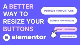
Using the right units, however, can be the difference between the effect being fully responsive or limited in its functionality. If you use pixels, for example, your heading can look good on desktop, but it might look completely off on mobile. That might force you to create numerous headings and hide them for different screen sizes. Which is a lot of extra work for a worse result.
Luckily, making it responsive is as easy as setting our font size to % (percent) or EM. That way, the parts of our heading we want to make bigger or smaller will always scale up or down with the font size. This will allow you to change the font size as much as you want and the proportions are going to stay the same. And, of course, this will make sure your headings look the way they should on all devices.
And since this is created entirely with CSS, it works anywhere, including other WordPress page builders.
#elementor #heading #responsive
Get in touch:
https://www.reialesa.com/youtube/
Don’t be shy! Let me know what you’d like to see next, ask me anything related to design or just simply say hi.
Please note that some of the above are affiliate links, which means I earn a commission if you make a purchase, at no additional cost to you. Thank you very much if you decide to use them!


