Master Dynamic Map Charts in Excel - Reveal Your Data's Story
How to create a dynamic map chart in Excel? - Interactive Charts and Dashboards
►Download free 2D / 3D Excel Maps and chart templates!
https://exceldashboardschool.com/cat/...
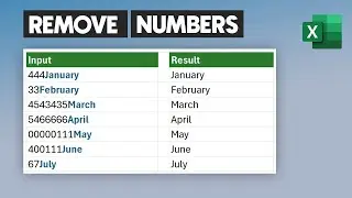
We'll show you how to create an interactive dynamic map chart in Excel. The map chart enables you to display key performance indicators by geography. Our solution is based on conditionally formatted shapes, so the map works on Excel 2007, Excel 2010, and above. In today’s example, we’ll show you how to create an Excel geographical state heat map!
Are you in sales, marketing, or risk? Use our ready-to-use maps in Excel to visualize performance. If you need to know how to create heat maps in Excel, check out our new project!
Using custom Excel shapes and formulas, we can create our interactive heat maps in Excel in a short time. Some programming knowledge is required, but you don’t have to worry about this.
We provide complete source code in the article; the map is free to download. As a precursor, look at the map below for the result.
The most general questions regarding dynamic maps in Excel:
How do I map an Excel spreadsheet?
What is a heat map chart?
How do I do a heat map in Excel?
How do I create a US map in Excel?
How do I create an interactive map in Excel?
What is a map chart?
1. Preparing Shapes in Excel
2. Building the Data Table and Textboxes
3. Creating the Legend and Color Scale
4. Writing a short VBA code
Check our tutorial about how to create US state heat maps in Excel and create visually effective excel dashboards.