How Nintendo Perfected Mario's Animations for Wonder
2D Mario has been looking stale for about a decade.
Luckily, Nintendo pulled out all the stops with Super Mario Bros. Wonder and brought their A-game.
The animation work in Wonder is truly top-notch. Good game animations go a long way in improving the feel of the controls and workign together with sound and music to make every interaction really pleasant.
I wanted to idenity 2 specific things I think really helped Nintendo to nail down the final presentation of Wonder. Those would be
Stylization and Good Use of Key Frame Animation.
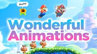
The style in Wonder is easily classified as ethereal and cartoon-y. The colors are over-the the top in the most wonderful way to match
the really expressive character animations. Mario works best in these conditions, the more expressive and simplistic his design, the better he matches up with his original concept.
The Key Animations bring everything together. The screen is always easily readable, as characters are always explicitly declairng what state they’re in with obvious animations. You could easily pick a frame from gameplay and present it as a photograph - kind of like how Wonder does that for you at the end of a stage! It's a far-cry from the boring old clay looking, smooth cycle animations in New Super Mario Bros. U
There are tons of things that work together in Wonder’s favor to make the fantastic game we get to experience. Amazing animation work is just one of those essential components and I wanted to share my appreciation for the work that was done on this title.
Timestamps
00:00 Animation Focus
01:04 Stylization
02:46 Key Animations
Questions, suggestions, requests? Let me know in the comments.
Thanks for watching,
have a lovely day!
#supermariobroswonder #mariowonder #davenodon