Responsive Image Gallery Layout Using CSS Grid
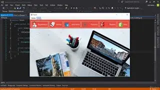
In this video, we'll be learning how to create a responsive image gallery using CSS Grid. We'll be using this layout to showcase pictures.
If you're looking to create a sleek, responsive image gallery using CSS Grid, then this video is for you! By the end of this tutorial, you'll be able to create a responsive image gallery that looks great on all devices!
You May Also Like:
Responsive Vertical Timeline Using HTML CSS
• Responsive Vertical Timeline Using HT...
Responsive Restaurant Website Using HTML CSS & JS
• Responsive Restaurant Website Using H...
Create a Responsive Website Using HTML CSS & JavaScript
• Create a Responsive Website Using HTM...
Coming Soon Website Using HTML CSS and JavaScript | Countdown Timer in JavaScript
• Coming Soon Website Using HTML CSS an...
Responsive Card Slider in HTML CSS & JavaScript
• Responsive Card Slider in HTML CSS & ...
If you are interested to become a front end developer, I will teach you everything step by step. I've been sharing the complete HTML, CSS and JavaScript based tutorial on my channel. Also I will be sharing those technology videos on my channel, want to improve you skills, keep touch my channel.
My All Source Codes
/ onlineittuts
Follow Us on Facebook
/ onlineittuts.com
Follow Us on Twitter
/ @onlineittuts
Follow Us on Pinterest
/ onlineittuts