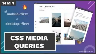
Learn CSS Media Queries (mobile-first vs desktop-first) through 4 Practical tasks - CSS tutorial
Media Queries are a key when it comes to building responsive layouts, it allows you to show different layouts based on different screen sizes. But how to use it correctly?
Download the resources: https://devchallenges.io/learn/tutori...
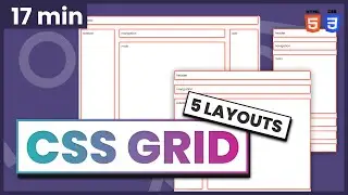
CSS Grid: • Learn CSS Grid by Building 5 Layouts ...
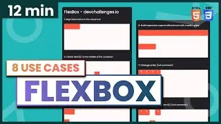
CSS Flexbox: • Learn Flexbox with 8 Use Cases in 12 ...
_________ 🔖 Tutorial Structure _________
Intro --
[00:00] - Introduction
[00:45] - Setup walkthrough
-- Main --
[01:15] - Task 1 - Mobile-first approach
[04:52] - Task 2 - Desktop-first approach
[08:33] - Task 3 - Orientation
[10:54] - Task 4 - More complex media queries
-- Ending --
[13:58] - Summary
[15:10] - Happy Coding
_________ 🐣 About me _________
I am the founder of https://devchallenges.io/
Follow my Twitter / thunghiemdinh
Join Discord / discord


![🔥 Professional Website from Start to Finish 2021 [Full Tutorial] | HTML, CSS Tutorial](https://images.videosashka.com/watch/CrryRvjYsgc)