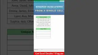
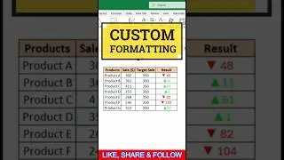
Using Conditional Arrows for Data Visualisation in Excel
In this video, learn how to enhance your Excel sheets with custom formatting that visually highlights your data!
I’ll guide you through the steps to apply arrows for positive and negative results, using green arrows to indicate positive values and red arrows for negative ones. This technique is perfect for dashboards, reports, and any scenario where you want your data to be instantly understood at a glance.
Don’t forget to like, subscribe, and share if you find this video helpful!


![Star Citizen - Making Money with an Aurora [GIVEAWAY]](https://images.videosashka.com/watch/o7JyUhfZ3Wo)