Creating a Responsive Navigation Menu with HTML, CSS & JavaScript
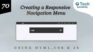
Welcome to Day 70 of my 75-Day UI Challenge! Today, we're building a responsive Navigation Menu using HTML, CSS, and JavaScript. A well-designed navigation menu is crucial for providing a seamless user experience on your website, especially on mobile devices.
What You'll Learn:
In this tutorial, you'll learn how to:
Structure a responsive Navigation Menu with HTML.
Style the menu with CSS for a clean and modern design.
Implement a mobile-friendly hamburger menu using JavaScript.
Ensure that the menu adapts smoothly to different screen sizes.
🔗 *Code Repository:* https://github.com/O-Tech-School/75-D...
Connect with Me:
🌐 [Website] https://otechschool.com
🐦 [Twitter] / otechschool
📸 [Instagram] / otechschool
📘 [Facebook] / otechsch
Join the Challenge:
Subscribe and hit the notification bell to stay updated with daily UI design challenges. Share your progress and tag me on social media with #75DayUIChallenge.
Thank you for watching! If you enjoyed this video, please give it a thumbs up, leave a comment, and subscribe for more web development tutorials.
#HTML #CSS #WebDesign #UIDesign #WebDevelopment #Coding #Programming #75DayUIChallenge


