Responsive Website Using HTML and CSS | CSS Grid and Flex Box
Responsive Website Using HTML and CSS
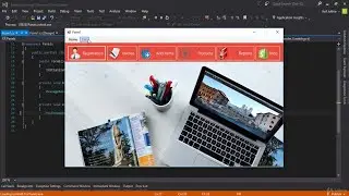
in this tutorial you we will learn How to make a responsive website using HTML and CSS.
So, guys, you must have a knowledge in HTML and CSS, then you are able to see the video and also you will learn understand that.
If you don't have any knowledge and ideas in HTML and CSS please don't watch the video.
Guys, inside the complete video tutorial you will learn step by step usage of CSS grid and also flexbox to manage the content inside the your website.
Also, you will learn how to use media queries for different screens size. So, guys you will learn a lot of new things inside the complete video.
I hope this tutorial is very helpful and beneficial for you.
You May Also Like:
Animated Portfolio Website HTML CSS JavaScript
• Animated Portfolio Website HTML CSS J...
How to Make Portfolio Website in HTML and CSS
• How to Make Portfolio Website in HTML...
CSS Grid Tutorial For Beginners
• CSS Grid Tutorial For Beginners
Flexbox Tutorial For Beginners
• Flexbox Tutorial For Beginners | Resp...
Media Query in CSS Full Tutorial
• Media Query in CSS Full Tutorial | Re...
OnlineITtuts Tutorials cover many topics such as Web Designing, Web Development, Programming, Databases. I was made many videos for different categories, and I will share another helpful tutorial for different topics. you can learn Basic to Advance Knowledge with practically.
Support Me on Patreon
/ onlineittuts
Follow Us on Facebook
/ onlineittuts.com
Follow Us on Twitter
/ @onlineittuts
Follow Us on Pinterest
/ onlineittuts