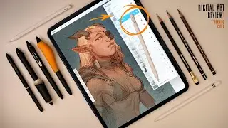
Apple Pencil Pro... Pro Artist Review: A Tech-Bump Hellscape.
Check out my Free Illustration Mini Workshop where I share my journey from Amateur to Pro: https://www.thedrawingcodex.com/illus...
You will get some simple advice on how to get more detail and polish in your work. How to think about composition. And my thoughts on how to prepare for professional work.
Let's take a deeper look at the new Apple Pencil Pro. And how this new tool bodes for Apple as a professional creative tech company.
The Pencil 'Pro' brings up a lot of questions around artist's tools and how we use them ...And what we should expect from people who make our tools.
Below is an Automagically generated summary to help understand the video and aid search optimisation: (I think it does a pretty good job of summing things up, despite sounding a bit generic)
----
Today, I'm looking at the new Apple Pencil Pro. It has some nice technological advancements and new features, but combined with the cost increase, and need to upgrade to a new iPad... it come with a hefty price tag.
Key Questions to Consider
Is it worth it?
Is it actually good?
Could it have been better?
How does this impact our relationship with Apple as artists?
Does this signal a time to get on... or get off, the Apple train... as creative professionals.
I've used iPads and Apple Pencils for years, often as a secondary or tertiary device, with my primary workstation being a PC. Despite some feedback suggesting I might be out of touch with modern mobile lifestyles, I've been using digital tools extensively, even as a digital nomad before it was a trend.
Initial Impressions:
When the first iPad Pro and Apple Pencil were released, I was among the first to buy them. I used them on the road and for various projects, experiencing both their strengths and limitations first-hand.
Features and Improvements:
The new Apple Pencil Pro features haptics, rotational control, and other improvements. While these are upgrades, the question remains: is it truly better? As artists, we adapt to our tools, whether they’re cutting-edge or not. Features like hover, which has been around on other devices for years, may not drastically change the user experience.
Fundamental Issues:
The Apple Pencil Pro is still not as ergonomically friendly as other tools. It's sleek but can be awkward to draw with. Despite improvements, it lacks major functionalities compared to older styluses from other brands. The design feels more like a spec bump than a genuine enhancement for artists.
Relationship with Apple:
Apple's focus on sleek, consumer-friendly design doesn't always align with the needs of professional artists. Tools should prioritize functionality and utility over aesthetics. The shiny, minimalist design ethos often disconnects from the messy, hands-on reality of artistic work.
Conclusion:
Is the new Apple Pencil Pro better? Yes, but it might not be enough. As artists, we need tools that truly support our creative process. This product feels like a step forward, but still not the leap we need. Let me know your thoughts in the comments.
----
Happy Drawing!
Tim Mcburnie
Learn Drawing and Illustration from me: www.thedrawingcodex.com
Portfolio: www.timmcburnie.com
www.artstation.com/tim-mcburnie
www.instagram.com/timmcburnie
twitter.com/timmcburnie


