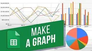
How to Graph a Function in Google Sheets | Creating Charts (Pie, Column and etc.) in Google Sheets
In this video, we will show you how to graph a function in Google Sheets.
You can add different types of charts in the spreadsheet that would best visualize your data. For example, in this sheet, we have a month-wise table of sales targets achieved by each account manager. Now let’s say we want to summarize this entire data in a graph. For that we will be adding a chart.
Let’s simply select the data from Column B to Column J over here. Next, we will move to the Insert menu and click on the Chart option.
By default Google Sheets recommends a graph for you, according to the data. This can be completely customized from the Chart Editor section here.
By opening up the Chart Type drop down menu, you can select a different format for your graph. For example, you can select a Pie Chart option, which will show you a month-wise breakup of the sales data.
Or, you can choose the bar chart graph which is best suited for segregating month-wise data.
If you want to change the range of the data being represented on the chart, you can enter a different range in the field over here. So for example, let’s just show the graph till July. For that, we will change the last column reference in the range.
Additionally, you can completely change how the chart looks. For that, let’s move to the customize tab.
From here, you can change everything from the chart style to the titles, series and legends. So for example, let’s change the background and border color of the chart. Now let’s change the default font of the graph as well.
Next, let’s change the axis titles. For example, we can change the chart title, the horizontal axis title where the months are showing and vertical axis title where the values of sales number achieved are being shown.
You can individually change all these sections available, including the background gridlines of the graph. Let’s just give them a lighter color for now.
Finally, you can open the actions menu on the bar. From here you can either download the graph in PNG or PDF format.
You can publish the graph on the web and set the title and description for the ALT Text in your chart.
To delete the chart, simply select the chart and click on the Delete key on your keyboard.
That’s all!
❓💬 Would you like to know about any particular Google Sheets feature? Let us know in the comments below.
#HowTech #GoogleSheets
--------------------------------------------------------------------------------------------------------------
✅ All our announcements are available here https://t.me/howtechtv
✅ Commercial questions [email protected]
✅ Facebook / howtechtv
✅ Instagram / howtechprojects
✅ Twitter / howtechprojects












![How to Make a Checklist in Google Sheets | Add a Checkbox | Create a To-Do [Task] List](https://images.videosashka.com/watch/wmyTjlONcig)
