5 Impressive Visuals You Didn't Know Excel Could Do
Make 5 awesome advanced excel charts and visuals to impress anyone!
🔥 Take our Power BI course: https://www.careerprinciples.com/cour...
🆓 DOWNLOAD Free Excel file for this video: https://careerprinciples.myflodesk.co...
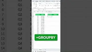
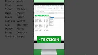
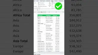
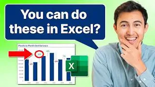
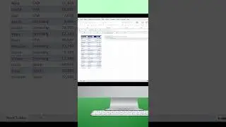
In this video you'll learn to make 5 awesome advanced excel visuals to impress anyone. First we'll make a waffle chart in Excel, where you can see the capacity out of the total. Then we'll make a line chart with markers, with some shapes to emphasize a general trend. Third, we'll make a radar chart to show how a restaurant is performing out of 100% in different metrics. Fourth, we'll make a variance charts to see the percentage change month over month. Finally, in fifth, we'll create a dumbbell chart which combines a scatter plot and lines.
LEARN:
📈 The Complete Finance & Valuation Course: https://www.careerprinciples.com/cour...
👉 Excel for Business & Finance Course: https://www.careerprinciples.com/cour...
🚀 All our courses: https://www.careerprinciples.com/all-...
SOCIALS:
📸 Instagram - https://www.instagram.com/careerprinc...
🤳 TikTok - / career_principles
🧑💻 LinkedIn - / careerprinciples
▬▬▬▬▬▬▬▬▬▬▬▬▬▬▬▬▬▬▬▬▬▬▬▬▬▬▬▬▬▬▬▬▬▬▬▬▬▬▬▬
Chapters:
0:00 - Chart 1
3:21 - Chart 2
5:50 - Chart 3
8:31 - Chart 4
11:23 - Chart 5


![[Ep.553, WEi] Еженедельный Айдол/Weekly Idol (рус.саб)](https://images.videosashka.com/watch/oWpe77N8Y2E)