Make a Pivot Table Profit & Loss Dashboard
Build an interactive profit and loss dashboard using Pivot Tables in Excel.
🔥 Take our Complete Finance & Valuation Course: https://www.careerprinciples.com/cour...
🆓 DOWNLOAD Free Excel file for this video: https://careerprinciples.myflodesk.co...
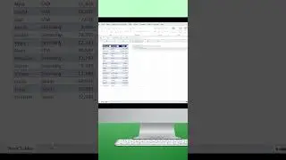
In this video we'll go from just having a raw set of data, to converting it into an interactive profit and loss statement dashboard in Excel using Pivot Tables, where you can filter a company's finances by region, by month, and even convert it into a budget vs actuals dashboard with Pivot Table slicers in just a few clicks. The 4 steps we'll take are setting up the P&L pivot table, making it dynamic, designing the dashboard, and finally creating the budget vs actuals.
LEARN:
🔥Power BI for Business Analytics: https://www.careerprinciples.com/cour...
👉 Excel for Business & Finance Course: https://www.careerprinciples.com/cour...
🚀 All our courses: https://www.careerprinciples.com/all-...
SOCIALS:
📸 Instagram - https://www.instagram.com/careerprinc...
🤳 TikTok - / career_principles
🧑💻 LinkedIn - / careerprinciples
▬▬▬▬▬▬▬▬▬▬▬▬▬▬▬▬▬▬▬▬▬▬▬▬▬▬▬▬▬▬▬▬▬▬▬▬▬▬▬▬
Chapters:
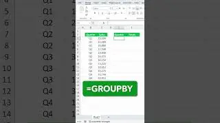
0:00 - Raw Data to Pivot Table P&L Statement
3:18 - Making the P&L Dynamic
5:17 - P&L Dashboard Design
9:53 - Actual vs Budget Dashboard