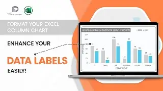
How to Format Y Axis Title in an Excel Column Chart?
In this video from the #datatodecisions series, learn how to add and customize the Y-axis title in Excel column charts.
In just a couple of minutes, you'll master the essentials to make your vertical axis title informative and visually appealing.
Perfect for enhancing your data visualization skills!
For a comprehensive guide on formatting all key elements of a column chart, check out our detailed tutorial: • Formatting a Column Chart in Excel: K...
To explore our fast-growing collection of free Excel tutorials covering a wide array of topics, please visit: https://indzara.com/datatodecisions/
*****************************************************************************
Check our latest product from Indzara, the Instant Chart Maker Template - Just enter your data, and see charts getting created instantly.
https://indzara.com/product/data-visu...
*****************************************************************************
#exceltutorials #datatodecisions #columncharts #datavisualization #excelskills #excelcharts #spreadsheet #microsoftexcel #datastorytelling #dataanalysis #advancedexcel #exceltips #verticalbarcharts #formatcharts #columnchartexcel #columnchartmaker #professionalcharts
Don't forget to like, comment, and subscribe for more Excel tips and tutorials.