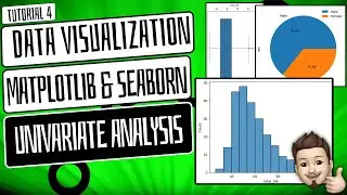
📊Stunning Scatter Plots ! Mastering Data Visualization with Matplotlib & Seaborn 📈
📊 Mastering Data Visualization:
Crafting Stunning Scatter Plots with Matplotlib and Seaborn! 🌟
how to create a scatterplot // scatterplot using matplotlib // scatterplot using seaborn // data visualization //
Ready to transform your data into captivating scatter plots that reveal hidden insights? In this tutorial, we're delving deep into the art of data visualization using Matplotlib and Seaborn. Whether you're a data analyst, scientist, or just eager to enhance your data presentation skills, get ready to create stunning scatter plots that tell compelling data stories!
📚 Understanding Matplotlib and Seaborn 🧭
Let's begin by demystifying Matplotlib and Seaborn, two powerful Python libraries that will help us create captivating scatter plots. Learn how these libraries work in harmony to produce professional-grade visualizations.
📊 Crafting Your First Scatter Plot 🚀
Get hands-on right away by creating your very first scatter plot. We'll guide you through the basics, from importing the libraries to plotting your data points.
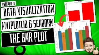
🎨 Customizing Scatter Plots with Matplotlib 🌈
Discover how to add a personal touch to your scatter plots with Matplotlib. Explore techniques to modify colors, labels, markers, and other plot elements, allowing you to craft visualizations that stand out.
📈 Enhancing Visualizations with Seaborn 🌟
Elevate your scatter plots with Seaborn's aesthetics. Learn how to apply styles, themes, and color palettes to transform your plots into eye-catching visuals that convey your data's story.
📈 Practical Examples: Hands-On Data Visualization 🖥️
We won't stop at theory – we'll dive into practical examples! Follow along as we create scatter plots with real-world data, showcasing the power of Matplotlib and Seaborn in action.
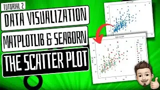
📈 Scatter Plots for Exploring Relationships 🌐
Unlock the potential of scatter plots for exploring relationships within your datasets. Understand how to visualize correlations, clusters, and trends that might otherwise go unnoticed.
🔑 Elevate Your Data Presentation Skills 📊
Whether you're a data analyst, scientist, or an aspiring data storyteller, mastering scatter plots is essential for effective data communication. Enhance your ability to unveil insights and patterns.
🔔 Stay Tuned for More Insights!
Don't miss out on future tutorials. Hit the notification bell and subscribe to our channel for upcoming videos on data visualization, Python programming, and data storytelling. Stay at the forefront of data presentation!
👍 Ready to craft stunning scatter plots with Matplotlib and Seaborn? Give this video a thumbs up, share it with fellow data enthusiasts, and let's embark on a journey of visualizing data like never before!
#DataVisualization #Matplotlib #Seaborn #ScatterPlots #DataAnalysis #PythonProgramming #ProgrammingTutorial #DataPresentation #DataStorytelling #DataViz #DataInsights
#DataVisualization #Matplotlib #Seaborn #LinePlots #DataAnalysis #PythonProgramming #ProgrammingTutorial #DataPresentation #DataStorytelling #DataViz #DataInsights
#PandasGroupBy #DataAnalysis #PythonProgramming #DataFrameManipulation #ProgrammingTutorial #DataAggregation #DataManipulationTechniques #ProgrammingSkills #DataGrouping
==========================================================
CHECK OUT OTHER PLAYLISTS:
PYTHON : • PYTHON FROM SCRATCH!!! -PYTHON TUTORI...
SQL : • SQL(Practical Implementations)
STATISTICS : • STATISTICS FOR DATA SCIENCE
Numpy : • Data Preprocessing & Manipulation.