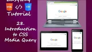
28. Introduction to CSS Media Query - Hindi
Today's World almost all website is responsive. To make a website responsive design all you need to know about CSS Media Queries. By using media query we can able to make a website responsive. Responsive in the sense of viewing total website correctly in Mobile, Tablet, laptop, Desktop and even large screens. Here in this video you will know what is media query and how it is used in Hindi.
You can follow me on Social Network.
Facebook Page / easyway.tutorial2016
Twitter / mondal_aftab
Google Plus https://plus.google.com/u/0/107681664...
Youtube / @easywaytutorials
Linked In / aftab-mondal-b78434a9
Quora https://www.quora.com/profile/Aftab-M...
Blog http://easywaytutorial.blogspot.in/
Please Subscribe to my channel.
Please Like, Share and comment on my videos.
Hope you will Enjoy my videos.


![HOW TO GET FISHMAN KARATE + SHOWCASE! [SQUARE PIECE]](https://images.videosashka.com/watch/hYK8KdZ8dW4)