PayPal's Website is Freaking Ugly
https://bit.ly/3BTQ97d 👈 Watch these redesigns in full length!
https://bit.ly/3NqBaHw 👈 Design like me. Use "UI2023" for 23% Off!
https://designcourse.com/af 👈 My upcoming "Advanced Frontends" Course
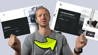
-- Today, we're taking a look at the home page of PayPal.com. Not only are we looking at it, we're refactoring it as well! It's plagued with a variety of UI/UX issues, so let's see how we can make big improvements.
0:00 - Intro
0:37 - Navbar
0:59 - Hero
3:17 - Features
3:49 - Solutions
5:13 - Comparison
Let's get started!
#uidesign #uiux #refactor
- - - - - - - - - - - - - - - - - - - - -
Subscribe for NEW VIDEOS!
Learn UI/UX: https://designcourse.com
My personal FB account: http://fb.com/logodesigner
Coursetro FB: http://fb.com/coursetro
Coursetro's Twitter: / designcoursecom
Join my Discord! / discord
^-Chat with me and others
- - - - - - - - - - - - - - - - - - - - -
Who is Gary Simon? Well, I'm a full stack developer with 2+ decades experience and I teach people how to design and code. I've created around 100+ courses for big brands like LinkedIn, Lynda.com, Pluralsight and Envato Network.
Now, I focus all of my time and energy on this channel and my website Designcourse.com.
Come to my discord server or add me on social media and say Hi!


![[FREE] ZILLAKAMI x Alternative Rock Type Beat](https://images.videosashka.com/watch/KTvUy5rxL4o)


