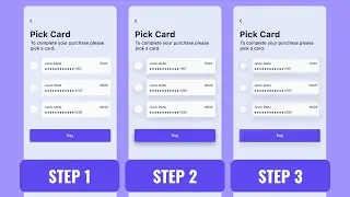
Figma Design System: Button Component States | Controls(+ practice file)
In this tutorial, we'll explore how to create a design system for button components in Figma, complete with different states such as hover, active, and disabled.
We'll also cover how to use Figma's powerful controls to make our design system flexible and reusable.
Whether you're a beginner or an experienced designer, this tutorial will provide you with valuable insights into creating consistent and efficient design systems.
You'll learn how to create and manage component libraries in Figma, use constraints to create flexible designs, and customize styles for different states of your button components.
And the best part? We'll also provide you with a practice file so that you can follow along with the tutorial and get hands-on experience creating your own design system.
So if you're ready to take your Figma design skills to the next level, hit that play button and join us on this exciting journey!
If you like this video, you might also be interested in my videos below:
1. Figma IntroductionTutorial For UI/UX Designers: Learn Figma Under 1 Hour: • Figma IntroductionTutorial For UI/UX Desig...
2. Figma Mobile App Design Tutorial With Components and Variants: • Figma Mobile App Design Tutorial With Comp...
3. Figma Tutorial - Color Styles For Your Design System: • Figma Tutorial - Color Styles For Your Des...
Practice File: https://www.figma.com/file/wzZscjAopY...
Chapters:
0:00 - 1. Primary Button Component Design
8:57 - 2.Secondary Button Component Design
15:02 - Outro
🚀 Subscribe for more weekly design content
https://www.youtube.com/c/AhmetEfeogl...
👨💻 Connect with me
https://www.ahmetefeoglu.net/
#uxdesigntips #learnuxdesign
/ ahmet-efeoğlu


