Part 13 | Python Programming | Reading an Excel file and Creating a Simple Linear Regression Graph
This is part 13 of a series of python coding I am having fun with and want to show others interested or stuck.
Code Example:
#We are going to read data from an Excel file and create a linear regression scatter plot
#First, import the necessary Modules
import numpy as np
import pandas as pd
import matplotlib.pyplot as plt
import statsmodels.api as sm
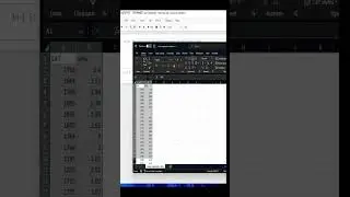
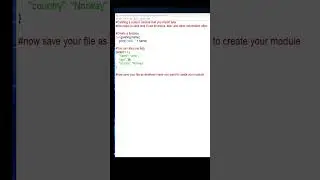
#We are going to use an Excel file that contains SAT scores and GPA
#Now we need to read the Excel file that we have in our folder
#In windows, you can right click and select the copy as path option
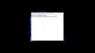
data = pd.read_csv('"C:\Users\dougl\Desktop\Udemy Courses\Data Science Course 2023\The Data Science Course 2021 - All Resources\Part_5_Advanced_Statistical_Methods_(Machine_Learning)\S32_L186\linear regression data.csv"')
#We must change the direction of our slashes to lean to the right in order to work correctly
data = pd.read_csv('C:/Users/dougl/Desktop/Udemy Courses/Data Science Course 2023/The Data Science Course 2021 - All Resources/Part_5_Advanced_Statistical_Methods_(Machine_Learning)/S32_L186/linear regression data.csv')
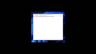
#Check to see if we can read the Excel file
data
#Next we will use the a method from on of the imported libraries .describe()
data.describe()
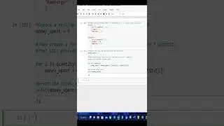
#Now create our x and y and assign which column belongs to the one we want
y = data['GPA']
x1 = data['SAT']
#Now lets display our results with the use of a graph
plt.scatter(x1,y)
plt.xlabel('SAT', fontsize = 20)
plt.ylabel('GPA', fontsize = 20)
plt.show()
#We can take it a step further and display the Ordinary Least Squares regression (OLS)
x = sm.add_constant(x1)
results = sm.OLS(y,x).fit()
results.summary()
#Now we can create the linear regression graph
plt.scatter(x1, y)
yhat = 0.0017*x1 + 0.275
fig = plt.plot(x1,yhat, lw=4, c='orange', label = 'regression line')
plt.xlabel('SAT', fontsize = 20)
plt.ylabel('GPA', fontsize = 20)
plt.show()
#python #pythonprogramming #pythontutorial #pythonforbeginners #shorts
Music: Paid Subscription with Wondershare Filmora


![Thanos vs Thor | Avengers: Sonsuzluk Savaşı (2018) | Türkçe Dublaj [1080p]](https://images.videosashka.com/watch/agVfb0KyT00)