Python Data Visualization: Mastering Matplotlib & Seaborn for Stunning Plots
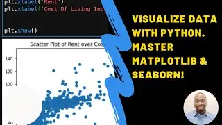
In this tutorial, we explore Matplotlib and Seaborn, two powerful libraries for creating high-quality visualizations in Python. Effective data visualization helps identify trends, communicate findings, and present insights compellingly.
In this video, you'll learn:
How to use Matplotlib to create essential visualizations, including line plots, bar plots, histograms, and scatter plots.
Customization techniques for enhancing plot readability and aesthetics by adjusting colors, styles, markers, and grid options.
The basics of Seaborn, a library built on Matplotlib, which simplifies the creation of beautiful, complex visualizations with a focus on statistical plots.
We'll also walk through practical examples like visualizing monthly sales with line plots, comparing product sales with bar plots, and analyzing data distributions with histograms. By the end of this video, you'll be able to create visually appealing and informative data visualizations for your projects.
If you found this video helpful, be sure to like, subscribe for more Python tutorials, and share your thoughts or questions in the comments!
Hashtags:
#DataVisualization #Matplotlib #Seaborn #Python #PythonDataScience #LearnPython #DataAnalysis #DataVisualizationTutorial #PythonCharts #DataPresentation