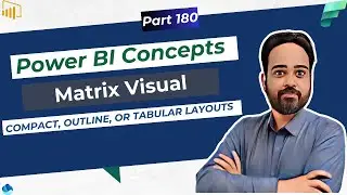
Power BI Tutorial: Creating Clustered Stacked Bar Visuals with Calculation Groups and Measures
на канале: Learn Microsoft Fabric, Power BI, SQL Amit Chandak
🚀 Master Complex Visualizations in Power BI!
In this tutorial, learn how to create sophisticated Clustered Stacked Bar Visuals using calculation groups in Power BI. Discover how to effectively display multiple measures and data distributions in a single visual, even when typical constraints limit the use of legends with multiple measures. This video guides you through the process of setting up two stacked bars in parallel — one showing the overall data distribution and the other highlighting specific segments.
🔧 What You'll Learn:
How to configure clustered stacked bars using calculation groups.
Techniques to include multiple measures without using a legend.
Strategies to visually differentiate and analyze data distributions.
👍 If you find this video helpful, please like, comment, and subscribe for more Power BI tutorials!
• Power BI December 2023 Updates: Maste...
⏰ Timestamps:
00:00 | Creating Clustered Stacked Bar Visual
00:40 | Why is this not so easy
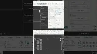
01:30 | Create a Calculation group and add a column
03:45 | How it works
👍 Like and subscribe if you find this video helpful. Don’t forget to hit the bell icon to stay updated on all things Power BI!
#PowerBI #DataVisualization #MicrosoftPowerBI #DataStorytelling #BusinessIntelligence
💬 Share Your Thoughts: Your feedback is invaluable! Join the discussion and share your experiences with these new features.
~-~~-~~~-~~-~
Please watch: "Microsoft Power BI Tutorial For Beginners✨ | Power BI Full Course 2023 | Learn Power BI"
• Microsoft Power BI Tutorial For Begin...
~-~~-~~~-~~-~
🌟 Explore the Comprehensive Power BI Tutorial: 50 Interview Questions and 10 Advanced Case Studies in a 6-Hour Video! 🌟
Watch here: • Top 50 Power BI Interview Questions &...