How to Create a Dynamic Axis in Power BI Using Field Parameters
Unlock the power of dynamic data visualization with field parameters in Power BI! In this detailed tutorial, we explore how to use field parameters to change chart axes dynamically, allowing for more interactive and clutter-free dashboards. Whether you're a beginner or an experienced user, you'll learn how to create a versatile data model, implement field parameters, and enhance your reports' usability and effectiveness.
🔹 What You Will Learn:
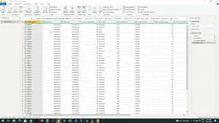
How to prepare and import data into Power BI.
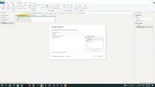
Step-by-step creation of field parameters.
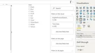
Implementing dynamic axes in charts for comparative analysis across different dimensions.
Tips on making your Power BI reports more interactive and user-friendly.
🔹 Who Should Watch:
Data analysts and business intelligence professionals looking to enhance their Power BI skills.
Anyone interested in improving their data visualization techniques.
Business professionals who want to create more effective and interactive reports.
Don’t forget to like, comment, and subscribe for more insightful tutorials on Power BI and data analytics. Dive into the video now to transform your static reports into interactive discovery tools with field parameters!
Download power bi data and report link
https://www.learndax.com/how-to-creat...