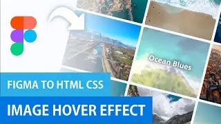
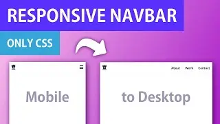
Responsive Navigation Bar Only CSS | Mobile First Design
Hamburger Button to Close Icon Tutorial: • Hamburger Menu to Close Icon | CSS An...
New to CSS Grid? Watch the full Crash Course here: • CSS Grid Crash Course | Beginners Tut...
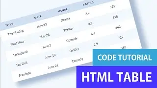
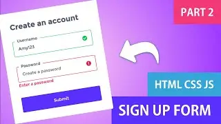
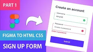
In this video I go over how to create this Navigation Bar using only HTML and CSS. I show you the full front end coding tutorial, where I create the structure of the elements in HTML and then write all of the styling and effects with CSS. I use Flexbox for the layout and initially I create the mobile view. I show you how to include a hamburger icon that changes into a close icon. For the desktop view I add media queries and transform the layout.
Enjoying this tutorial? Subscribe to stay up to date with my latest content: / @angeladesign737
Codepen: https://codepen.io/angeladelise/pen/p...
In this video I show you:
0:00 - Intro
0:15 - Starting HTML Code
0:41 - HTML Code
3:44 - CSS Code - Mobile View
12:01 - CSS Code - Desktop View
Want to improve designer to development handoff? View my Sketch to Zeplin workflow here: https://www.youtube.com/watch?v=D3ZF2...
--
Gear
Microphone - https://amzn.to/34bDTxH
Hard Drive - https://amzn.to/30m5E5M
--
Let's Connect
Dribbble: https://dribbble.com/angeladelise
Blog: / angeladelise
--
DISCLAIMER: Links included in this description might be affiliate links. If you purchase a product or service with the links that I provide I may receive a small commission. There is no additional charge to you! Thank you for supporting my channel so I can continue to provide you with free content each week!

![Complete online adult ballet center [30 minutes]](https://images.videosashka.com/watch/IgZEpRMQ-cE)