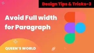
When Designing Avoid Full Width Paragraph🤔 || Design Tips & Tricks -3 ||Tamil ||Figma
🚀 Mastering Design: Avoiding Full-Width Paragraphs
Welcome to Queen's World ! In this design tutorial, we're diving into a crucial aspect of creating visually appealing layouts—why you should avoid using full-width paragraphs.
🔍 Key Takeaways:
The visual impact of full-width paragraphs on user readability.
Practical examples showcasing the drawbacks of expansive text spans.
Strategies to enhance readability and create engaging content layouts.
🖥️Topics Covered:
Understanding the impact of text width on user experience.
Balancing design aesthetics with user-friendly layouts.
Tips for breaking up content for better comprehension.
👩💻 Who Is This For:
UI/UX Designers
Graphic Designers
Anyone Interested in Design Principles
🎥 Watch Next:
Tips & Tricks 1 : • As a design your should know about th...
Tips & Tricks 2: • 🤩Simple Rule for Consistent Border Ra...
📌 Connect with Me:
LinkedIn: / kohila-b-156124231
Don't miss out on this insightful tutorial! Hit the like button, subscribe for more design tips, and let's elevate our design game together! 🚀✨
#DesignTips #UIUXDesign #Typography #LayoutDesign #DesignPrinciples #Figma #Sketch #AdobeXD #CreativeDesign #DesignTips #Typography #LayoutDesign #VisualHierarchy#graphicdesign #UXDesign
#ContentLayout #Readability #GraphicDesign #DesignPrinciples #UIUX
#FigmaDesign #SketchTips #AdobeXDDesign #UserExperience #WebDesign #CreativeLayouts #TextSpacing #DesignTutorial #Whitespace #VisualDesign