Power BI Dynamic Indicator Icons: What They Mean & How to Use Them
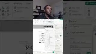
Dynamic Indicator icons are a great way to look at KPI data to quickly get a big picture of how things may be trending in your data set. This Power Bi tip will help improve the way you look at data by using dynamic indicator icons to simplify the way you look at trends. Feel free to experiment with the data and follow along from the GitHub link in the video description.
2023
Data used in this report: https://tinyurl.com/saleget
Thanks for watching! Leave a comment to provide feedback!
Recording Setup 🎤
iPhone 11: https://amzn.to/3RZu2TW
MicroPhone: https://amzn.to/3z4B80v
Wireless Mic: https://amzn.to/3Bo5TAe
Flex Arm: https://amzn.to/3PV6dKO
Drone Equipment 🛸
DJI Mini 2: https://amzn.to/3RVUXQm
Custom Joysticks: https://amzn.to/3z8N3ub
Landing Gear: https://amzn.to/3PwK4mh
Day Filters: https://amzn.to/3b74JP1
GoPro 🎥
Hero9: https://amzn.to/3RWLp7N
Charger: https://amzn.to/3RZ3oKM
Media Mod: https://amzn.to/3Osjtpr
GoPro Stick: https://amzn.to/3RXUAEU
🗣 Connect with me on social
LinkedIn: https://tinyurl.com/yckpwwpz
Twitter: / carlhufftech
Facebook: / carlhufftech
🙏 Request How To Tutorial Videos
Leave a comment to request.
🔔 Subscribe to my YouTube channel
https://tinyurl.com/yckuv78h
🎬 Want to watch again? Navigate back to my YouTube channel quickly
https://tinyurl.com/yckuv78h