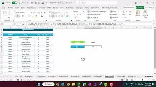
Quick 3D Container Chart in Excel
#3DChart #ExcelChart
Hello Friends,
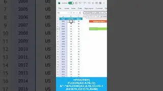
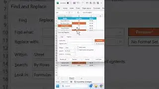
In this video, you will learn how to create a beautiful 3D container chart in Microsoft Excel. We have used a 3D Stacked column chart to create this chart. You can use this chart to show the KPI metrics like - Service Level, Quality score, Gross Margin, etc.
We have created 2 versions here
1: Cylinder version:
2: Box version
Download the practice file from the below link:
https://www.pk-anexcelexpert.com/quic...
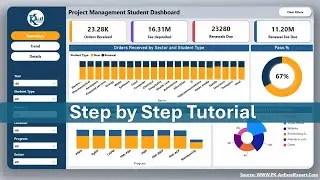
Download the Free Project Management Dashboard
https://www.pk-anexcelexpert.com/exce...
See our Power BI Dashboard videos:
• Power BI Tutorial
Learn and download our interactive Excel dashboards free of cost-
• Excel Dashboards
Download the Calendar Control in VBA from below link
https://www.pk-anexcelexpert.com/full...
Download our free Excel utility Tool and improve your productivity:
https://www.pk-anexcelexpert.com/prod...
See our Excel Products:
https://www.pk-anexcelexpert.com/prod...
Visit to learn more:
Chart and Visualizations: https://www.pk-anexcelexpert.com/cate...
VBA Course: https://www.pk-anexcelexpert.com/vba/
Download useful Templates: https://www.pk-anexcelexpert.com/cate...
Dashboards: https://www.pk-anexcelexpert.com/exce...
Watch the best info-graphics and dynamic charts from below link:
• Dynamic Graphs
Learn and free download best excel Dashboard template:
• Excel Dashboards
Learn Step by Step VBA:
• VBA Tutorial
Website:
https://WWW.PK-AnExcelExpert.com
Facebook:
/ pkanexcelexpert
Telegram:
https://t.me/joinchat/AAAAAE2OnviiEk5...
Pinterest:
/ pkanexcelexpert
LinkedIn:
/ pk-anexcelexpert
Instagram:
/ pkanexcelexpert
Visit our Amazon Store
https://www.amazon.in/shop/pkanexcele...