Python Data Analysis Bootcamp class 8 - 01 Plotly Histogram Histplot
Complete DataSimple's Python Data Analysis Certification
https://www.udemy.com/user/brandyn-ew...
Free access to Python Workbook with code at DataSimple.education
https://www.datasimple.education/data...
Data Analysis Tips
https://www.datasimple.education/data...
ML Tips
https://www.datasimple.education/data...
Deep learning
https://www.datasimple.education/data...
Python Guided Projects
https://www.datasimple.education/data...
Connect with Data Science teacher Brandyn
https://www.datasimple.education/one-...
on facebook
/ datascienceteacherbrandyn
on linkedin
/ 87118408
On kaggle
https://www.kaggle.com/brandyndatatea...
On TikTok
/ datascience.teach
On Instagram
/ datascienceteacherbrandyn
Python Ai-Enhanced Bootcamps
https://www.datasimple.education/boot...
Ai Art Collections
https://www.datasimple.education/data...
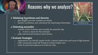
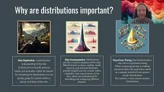
When utilizing Plotly for histograms, it is crucial to understand how distributions relate to other categories and continuous features. This can be achieved by exploring stacked histograms, which allow you to visualize the distribution of a variable while considering its interactions with other categorical or continuous variables. Key parameters to pay attention to include 'nbins' for controlling the number of bins in the histogram, 'color' to differentiate various categories or features, and 'histfunc' to specify the aggregation function for stacked histograms. Additionally, 'pattern_shape' can be employed to enhance the visual distinction of data subsets, aiding in the interpretation of complex distribution patterns.
#python #dataanalysis #seaborn #pandas #histogram #univariate #analysis #dataanalytics #data #learnpython #pythondatasciencetutorial #distribution #dataanalyticstraining #dataanalyst