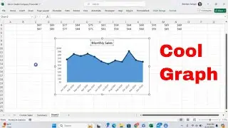
How to Make a Bar Chart That Shows the Largest Value for Each Category in Microsoft Excel!
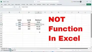
In this tutorial, I want to show you how you can make a bar chart that shows the largest value for each category in Microsoft Excel! To do this, you can use a MAXIFS function, that will grab the max value for each category in your data. I hope that you found this tutorial to be helpful, and if you did please like, subscribe, and comment.
#data #datavisualization #msexcel #graph #howto #trending #tutorial #excel #msexcel #wow #tips #tipsandricks #exceltips #excelsettings #finance #excel #pivottables
@LeilaGharani @techteachersandstudents
@freecodecamp @TeachersTech @excelisfun
Keep calm I have a spreadsheet for that t-shirt
https://amzn.to/4cSyKNF
Freak in the Excel Sheets?
https://amzn.to/3GoOI33
My Official Patron Page -
patreon.com/ExcelTutorials
Get Office 365 - https://amzn.to/3sUld5V
Get an amazing new laptop!!
https://amzn.to/3T2ppLu
Have all of the keyboard shortcuts at the tip of your fingers
https://amzn.to/3SSpHof


![Spider-Man Web Of Shadows [PART 3] [LUKE CAGE GÖREVLERİ]](https://images.videosashka.com/watch/f8WpdUq2T24)