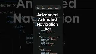
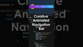
How to make Portfolio Website | Eye-Catching Header Bootstrap – Navbar & Logo in Minutes – Part 2
Create a Stunning Responsive Website Header with Bootstrap – Navbar & Logo!
🚀 Welcome to this tutorial where we’ll show you how to create a stunning and fully responsive website header using Bootstrap! In this video, we’ll guide you step-by-step through building a sleek navigation bar with a logo, ensuring your portfolio website looks amazing on all devices. Whether you're a beginner or an experienced developer, this easy-to-follow guide will help you design a modern header in just minutes!
🎯 What You’ll Learn in This Video: ✅ How to create a fully responsive Bootstrap navbar
✅ Adding a logo and menu links to your header
✅ Making the navigation mobile-friendly with a dropdown
✅ Styling your navbar for a modern, professional look
✅ Step-by-step coding so you can follow along easily
📌 Video (Part 1) Setup & Final Result ➡️ • How To Make an Amazing Portfolio Webs...
👨💻 Full Tutorial: • Build an Impressive Portfolio Website...
🔹 🔗 Resources & Links:
🔗 Bootstrap 5 Documentation: https://getbootstrap.com
🔗 Font Awesome Icons: https://fontawesome.com
🔗 Google Fonts (For Custom Typography): https://fonts.google.com
🎯 Who Should Watch This?
✅ Beginners who want to build a professional portfolio website
✅ Developers & designers looking for a quick Bootstrap navbar solution
✅ Anyone who wants to make a modern, responsive header without hassle
🔔 Like, Subscribe, and Turn on Notifications so you don’t miss the next part! 🚀
#Bootstrap #Navbar #portfoliowebsite


![CALLIGRAPHY ON IPAD TABLET [Arabic script on an abstract background]](https://images.videosashka.com/watch/Uu6CVlzLGhA)
